Stacked, full colour
Our master logo. Use it on white or very light backgrounds.
Press and partners
Everything you need to put our name and our logo on a page: the master logo and its variants, the symbol, app icons and the colours behind them. Take what you need, no permission required, as long as you keep to the handful of rules further down.
The full brand book, all 91 pages of it: Style guide (PDF) 8.8 MB
The stacked, full colour logo is our master. Reach for it first, and only drop to another version when the space or the printing method rules it out.
Our master logo. Use it on white or very light backgrounds.

The same logo with a white wordmark, for dark backgrounds and photography.
For wide, shallow spaces: site headers, banners, email signatures.
The horizontal lockup for dark backgrounds and photography.

Single ink only: embroidery, engraving, fax-grade print, anywhere the gradient cannot survive.

The single ink horizontal lockup, for the same situations.
The mark on its own stands in for the full logo only where we are already named: an avatar, a favicon, an app tile. It is not a substitute for the logo in body copy or on a partner page.

Transparent background, square canvas. Favicons, avatars, watermarks.
The same shape as a flat silhouette. This is the one to use for stencils, masks and single ink print.
The mark on white. Use where the surrounding interface is light.

White mark on the brand gradient. Our default on the App Store and Google Play.
A Pride variant of the mark, drawn as part of the brand kit. It is a seasonal variant rather than an alternate master, so please do not swap it in for the standard logo.
The mark with the flag running through it, on a dark ground.
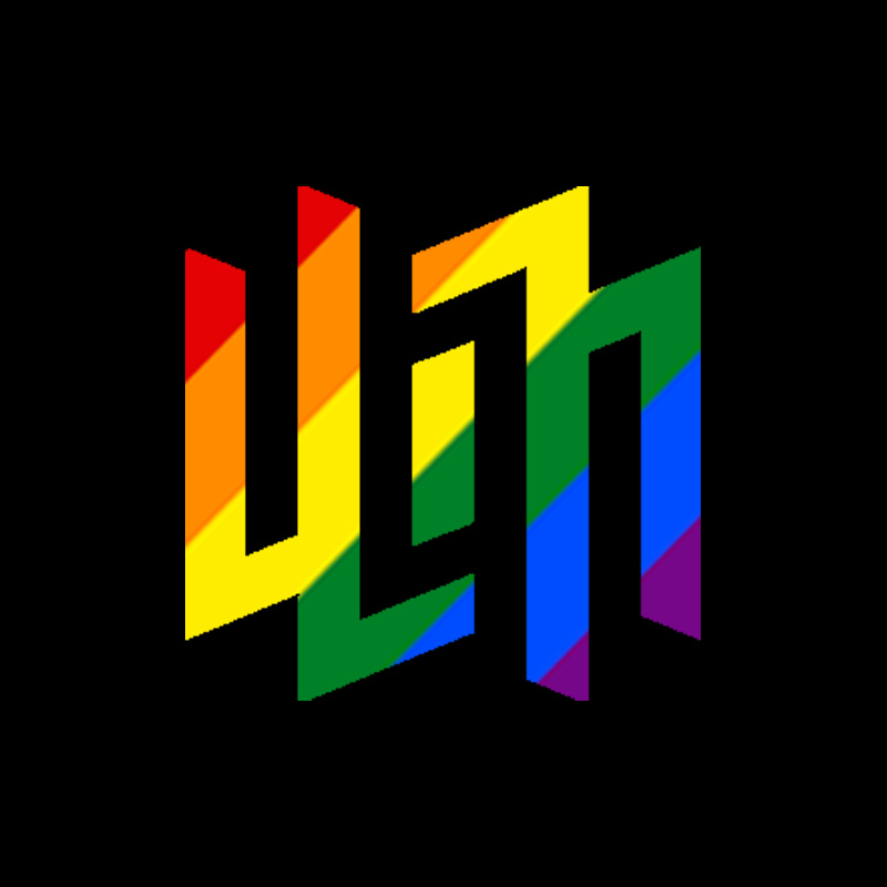
Hard flag stripes rather than a blend, on black. Holds up better at small sizes.
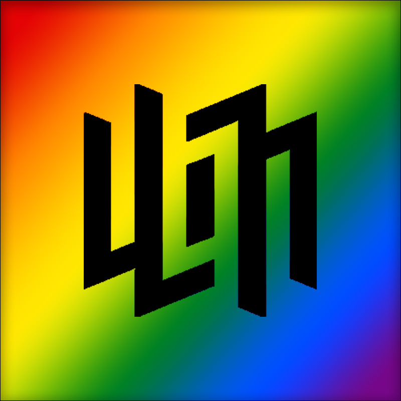
The mark knocked out of a full rainbow field, for banners and headers.
Two animated builds of the mark, for video stings and stream overlays. Both end on the static logo: hold that frame rather than looping the animation behind a talking head.

The mark draws itself in. 1000 x 1000, transparent GIF or MOV.

The panels slide into place. 1000 x 1000, transparent GIF or MOV.
One accent, one gradient, and a set of supporting ramps behind them. If you are only taking one value, take maGGenta.
#E75971
The accent, and the colour to reach for if you only take one. Links, hover states, the active rule under a tab, the app icon tint.
The mark runs on one diagonal gradient, from Sunset in the top left to Magenta in the bottom right, passing through #FB5363 at the midpoint. Sample it, do not rebuild it by eye.
Gradient: #FD6E38 to #F9388E, 135 degrees.
These come from the brand book and support the accent and the gradient rather than competing with them.
The master gradient, and the only place the two ends appear on their own.
#FD6E38
CMYK 0 / 70 / 82 / 0
#F9388E
CMYK 0 / 90 / 10 / 0
The wordmark sits on the darkest of these. The rest carry type, rules and panels.
#40444C
CMYK 70 / 60 / 50 / 40
#565A62
CMYK 65 / 55 / 45 / 25
#8E9196
CMYK 47 / 37 / 35 / 5
#C7C8CA
CMYK 22 / 17 / 15 / 5
The secondary accent. Use it for contrast against the gradient, not as a substitute for it.
#611A8B
CMYK 77 / 100 / 0 / 0
#9963BA
CMYK 45 / 70 / 0 / 0
#D2B1E6
CMYK 17 / 32 / 0 / 0
Tints, for backgrounds and fills that sit under the accent. The guide heads this ramp with a warmer coral that the site replaced with maGGenta, so the head is shown above rather than here.
#FC8186
CMYK 0 / 62 / 34 / 0
#FDABAE
CMYK 0 / 41 / 18 / 0
#FED5D6
CMYK 0 / 20 / 7 / 0
The reversed and one colour cuts of the logo are drawn in these and nothing else.
#FFFFFF
CMYK 0 / 0 / 0 / 0
#000000
CMYK 20 / 20 / 20 / 100
One thing to know if you are working from the PDF as well as this page: the brand book was drawn in 2018 and heads its Orange ramp with an earlier, warmer coral. The site standardised on maGGenta #E75971, and the build now fails on the older value, so it appears nowhere in the codebase. Where the two differ, this page is the current one.
Poppins for headings, Inter for everything else. Both are free from Google Fonts, so you can set anything to match us without licensing a thing.
Aa
ABCDEFGHIJKLMNOPQRSTUVWXYZ abcdefghijklmnopqrstuvwxyz 1234567890
Headings, at every level.
Regular 400, SemiBold 600
Aa
ABCDEFGHIJKLMNOPQRSTUVWXYZ abcdefghijklmnopqrstuvwxyz 1234567890
Body copy, interface labels and everything that is not a heading.
Regular 400, Medium 500, SemiBold 600, Bold 700
The brand book sets Roboto as the corporate font, and the PDF above still says so. The site and the apps run Poppins and Inter, so that is what this page publishes. If you are matching our look on screen, use these two.
Short version: use the files as supplied, give the logo room, and do not redraw it. The three rules below are the ones that get broken most; the style guide (PDF) has the diagrams and the rest.
The mark and the wordmark are built on the same grid of evenly spaced vertical strokes. That shared rhythm is why the mark reads as the first letters of the name rather than a badge parked next to it, and it is why redrawing either half separately, or changing the gap between them, breaks the logo rather than adjusting it.
The guide sets a module, X, off the logo's own construction and asks for at least one X free on all four sides. Nothing goes in it: no type, no rule, no frame, no colour plate, no crop. If the logo is tight against something, it is too big for the space rather than the space being too small.
Full colour on light, reversed on dark. For the one colour cut the guide draws a threshold: the inverted version holds from roughly 50% to 90% black, and past that it stops being legible, so on near-black use the positive. Where the background colour fights the gradient, drop to the one colour inverted logo rather than recolouring the master.
Need a screenshot, a quote, an interview, or an asset that is not here? Get in touch and a person will read it.
Gamer Guides is a registered trademark of Gamer Guides Ltd. These assets are provided for editorial and partner use, and remain our property.